
PAGE 1 -> COVER SLIDE
The First Thing a VC Sees
& Why Most Founders Blow It
What Do VCs and Angel Investors Actually Want to See on Your Pitch Deck Cover Slide?. Your cover slide is not a title page. It's a 3-second audition. Here's what gets you to slide 2.
THE STRATEGIC TRUTH
What Guy Kawasaki Says About the Cover Slide — And Why It Still Works in 2026

What is the Formula
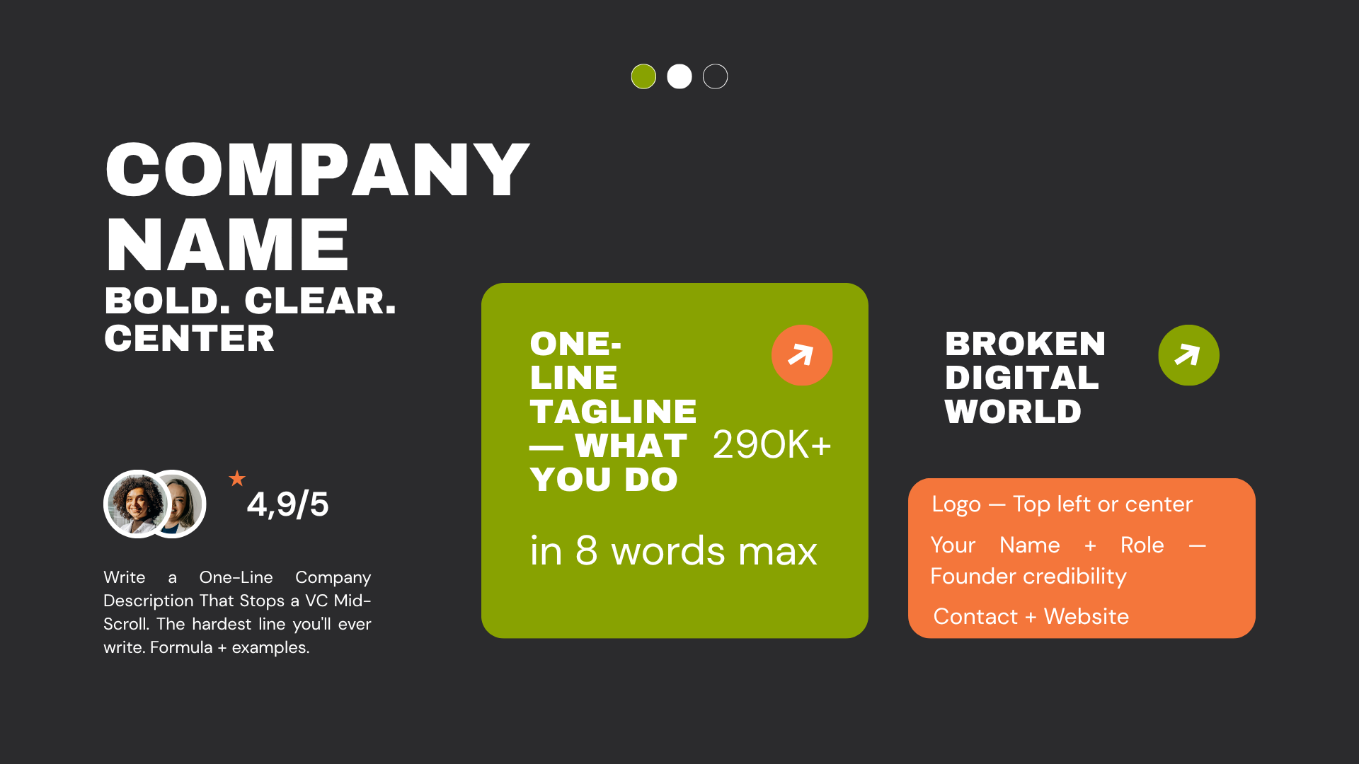
How to Write the One Line That Makes Angels Stop and Read
The one-liner is what VCs remember after seeing 50 decks in a day. Get this wrong and your company name disappears with the pile
- Under 10 words
- No jargon
- Outcome-not feature-led
- Passes "explain to your mum" test
FAQs
Find Answers to Your Questions
A startup pitch deck cover slide should immediately tell investors who you are, what you do, and why it matters. At a minimum, include your company name, logo, a concise tagline, and presenter information. Many founders also add their website and fundraising round. The cover slide is not meant to explain the entire business—it should create clarity and curiosity. A strong cover helps investors understand your company within seconds and sets the tone for the rest of the presentation. Avoid clutter, excessive text, and unnecessary graphics that distract from your core message.
A strong pitch deck cover slide can work with either a background image or a plain design. The key is clarity. If you use an image, it should reinforce your company’s mission, product, or industry without distracting from the title. Many successful startup pitch decks use clean visuals with minimal text. For deep-tech, AI, SaaS, and B2B startups, a simple branded background often looks more professional than a generic stock photo. Investors care more about the story and opportunity than elaborate graphics, so prioritize readability over design complexity.
The best pitch deck taglines are short, clear, and memorable. Aim for 5–10 words that explain what your company does or the value it creates. A strong tagline helps investors immediately understand your business before diving into the deck. Avoid buzzwords and lengthy descriptions. Instead of explaining every feature, focus on the outcome or problem you solve. If an investor cannot understand your company within a few seconds of viewing the cover slide, the tagline is likely too long.
In most startup fundraising situations, a confidentiality notice is unnecessary. Angel investors, venture capital firms, and accelerators review hundreds of pitch decks and generally do not sign NDAs before an initial meeting. Adding a large confidentiality disclaimer can sometimes make founders appear inexperienced. If your technology involves sensitive intellectual property, patents, or trade secrets, protect those details by limiting disclosure rather than relying on a cover-slide notice. Most investors are interested in the business opportunity, not copying ideas.
General rules:
- Dark backgrounds = premium feel, used by 70% of funded decks
- Light backgrounds = clean, easier to read in bright rooms
- Max 2 colours on cover — never more
- Font: Inter, Helvetica, or Montserrat — never decorative fonts

Need expert feedback on your pitch deck? Get a free AI-powered audit and uncover the improvements that could make investors pay attention.